
INDIGO Design Award – 2025
• Gold Winner in Branding for Health & Beauty cat.
• Silver Winner in Branding for Graphic Design
• Silver Winner in Branding for Food – Other cat.
For the brand’s naming, we drew inspiration from Ancient Greek, where the term Siopé means “silence”. The project’s aim was to interpret the slow passage of time and the solemn silence of nature, transforming them into gastronomic and cosmetic products that celebrate its most intimate value.
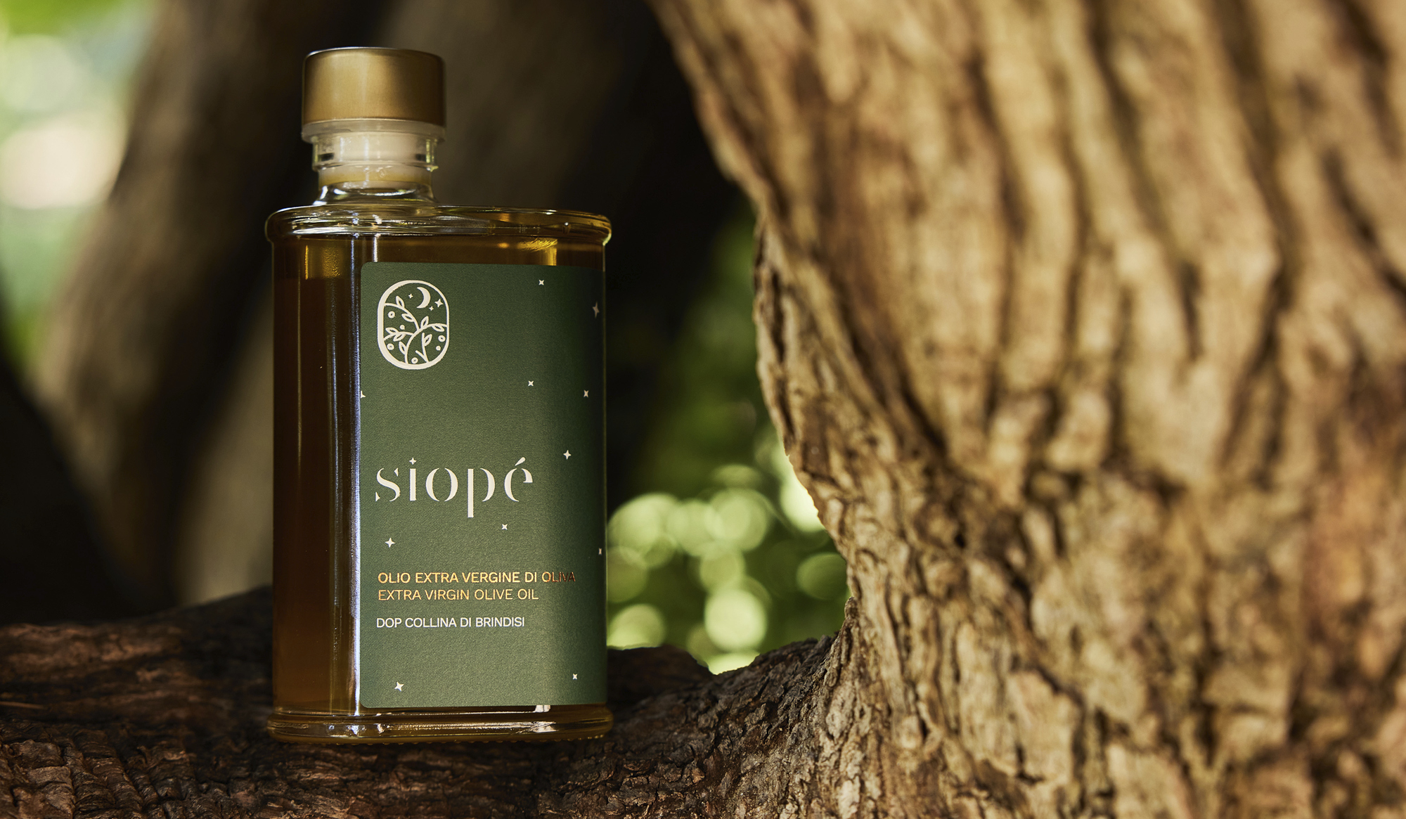
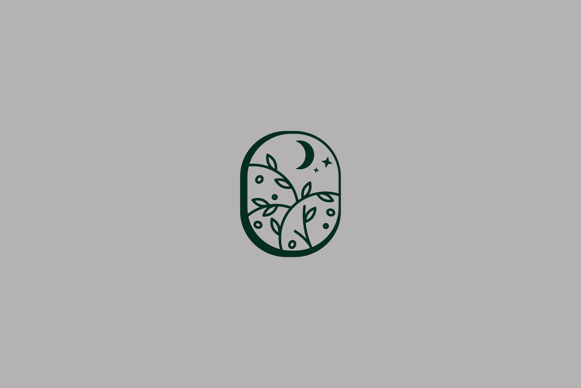
The Siopé logo – comprising both logotype and symbol – was the result of a careful and detailed study of the brand’s identity and vision. The “peephole” of the symbol opens onto a nocturnal, floral landscape where a crescent moon symbolises essentiality and peace, creating a continuum between sky and earth, humanity and nature.
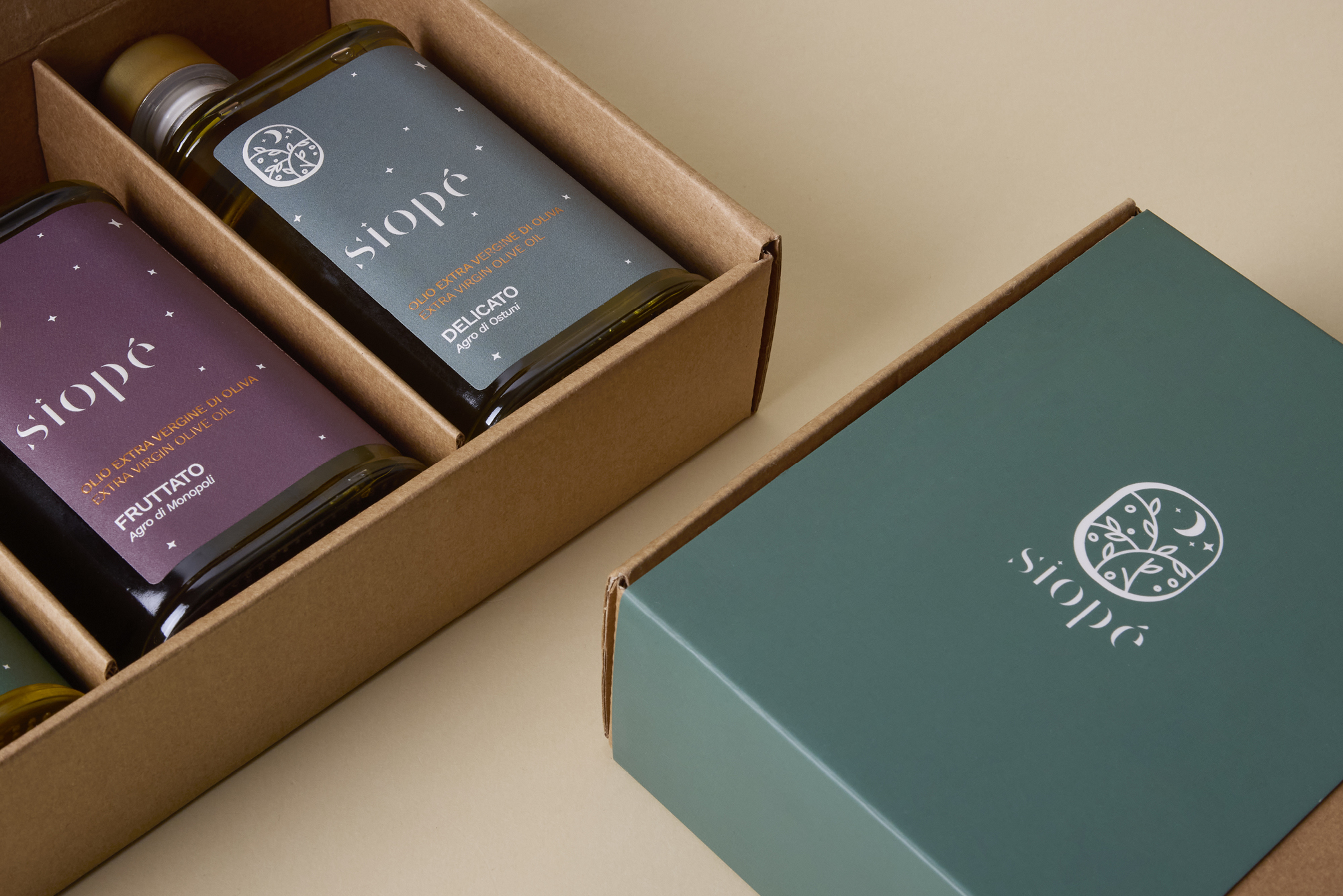
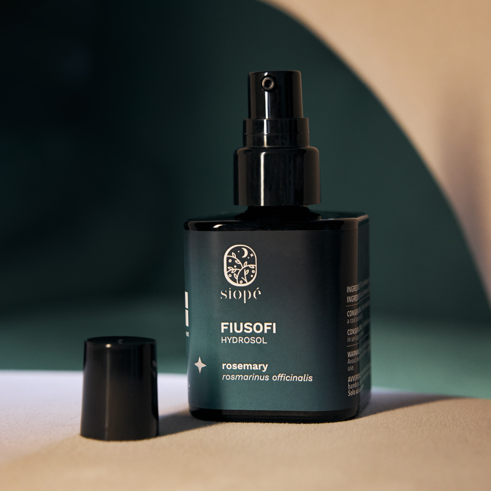
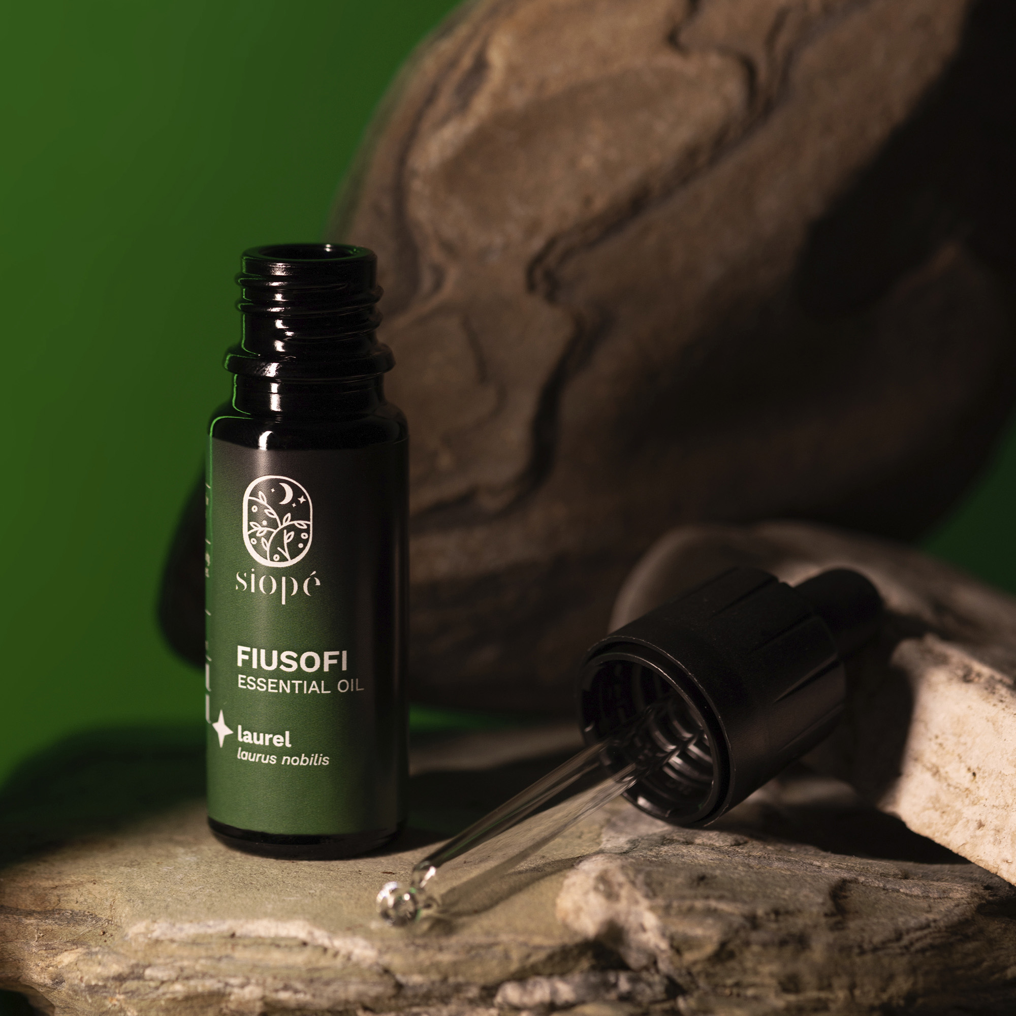
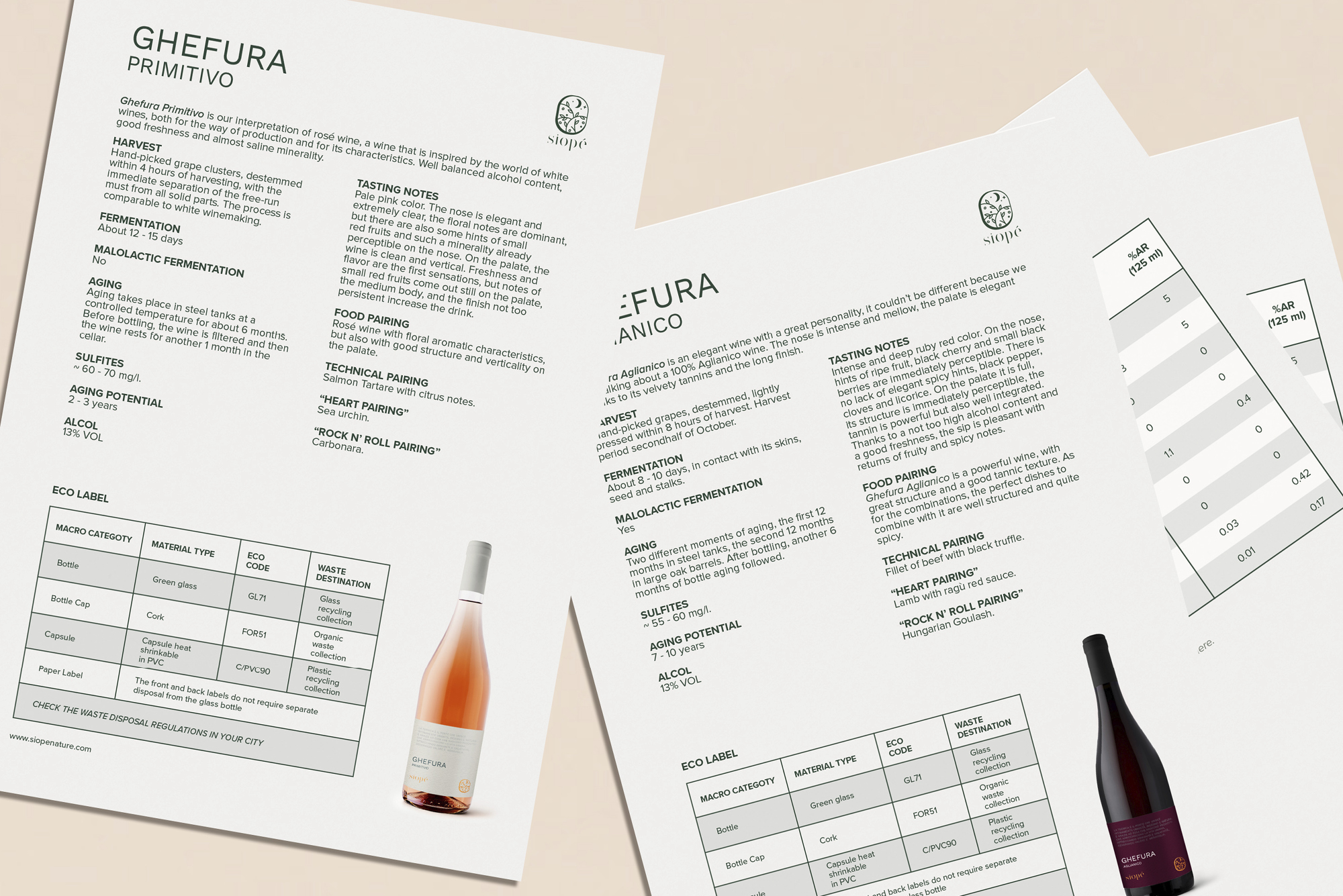
The label and packaging were designed with the same sense of continuity in mind: a starry sky that does not end abruptly but rather embraces and gently accompanies the overall design of the product.